
everyone has been weighing in on the new sl 2.0 and i’ve been too busy to really go though and see what i like and dislike about it. i tried it on the day they brought it out and spent about 10 minutes it in and it left me with a sour taste in my mouth honestly.
please click on the cut to keep reading. be warned, its long and full of pictures!
well since i picked it up a couple weeks ago there’s apparently been an update so i’m checking it out again. of course i do dislike it a bit since its the official client and therefore does not have my sexy emerald client goodies, but i’m not going to take off points for that. i can only hope and pray that the emerald guys will take the GOOD STUFF from this new viewer (tattoo layer, alpha layers) and leave out all the crap. please click on the photos for a larger version of the image!
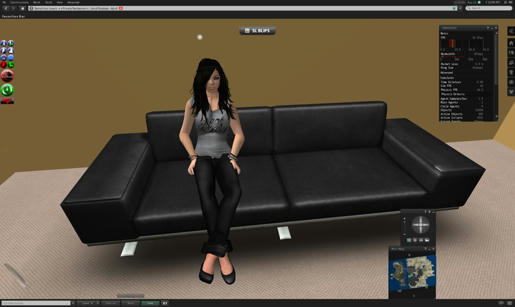
first and foremost. I LOVE THE COLOUR SCHEME! its dark and that makes me happy in pants. sexy blacks and mint green and silver… thank you so much LL.
and now for a weird thing… you see this outfit i have on in the pictures? this is not the outfit i was wearing when i logged out of emerald an hour ago. this is the outfit i had on when i logged out of the sl 2.0 client over 2 weeks ago! i have no idea what is up with that but its very weird.
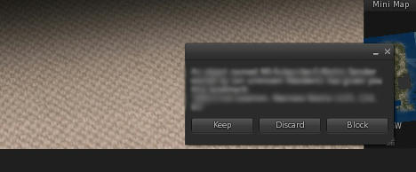
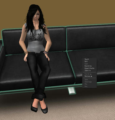
ah here’s a good time to talk about something i don’t like about the new client… see that little ass window there? that’s a notification that i just recieved something. seriously? i dislike this… i much prefer the big blue box. i know it was ugly but it was easier for me to recognize that i had something sent to me than this tiny box on the bottom of my screen.
and that brings me to another thing i dislike about this new viewer. they have moved EVERYTHING. i have ocd and one of the things i have trouble with is changes in position of things. in my usual emerald sl client, i have my minimap at the top of the screen, under that is my camera control box, next to that is my statistics box (cause i like to watch my fps go up and down 8D) my ims and chat window are on the left where they are supposed to be. of course i can move stuff around to get that same configuration but the thing that bugs me is this damn sidebar.
with my usual configuration of windows, the sidebar is partially obscured, which means i will have to get used to a completely new configuration. while this might be not a big deal to you, someone like me has a lot of trouble with this sort of thing.. its like moving my desk around and expecting me to work like that.
ok so lets move some crap around *grumbles* and take a look at this sidebar. at first glance i honestly dislike it. it takes up a large chunk of my screen space and when its minimized those windows that i had to shove next to it don’t go to the edge of the screen.
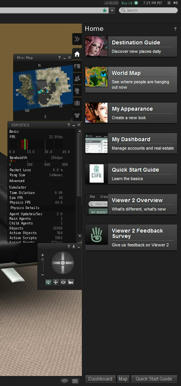
but lets dig deeper into this thing. the first page (the little house button) has some boring junk that i guess is tailored to noobs.
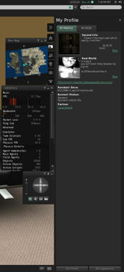
tab 2 is your profile and let me tell you.. I HATE THIS. my profile info is cut off and you can only read it by clicking more… there’s all this empty space that they could fill by just allowing the profile info to extend to the full box size, so no one has to push the more link, because you know people arne’t going to bother to push the more link and therefore if you had anything important written there, they won’t see it.
profile photos have been reduced to this tiny live journal icon size format and that kinda makes me sad cause i usually put a lot of work into my profile photos… they could at least offer something to let you see the full size version, like emerald currently does.
i do like that they have included your avatar’s age on your profile.. as you can see i’m almost 4 years old 😀 (is that a good thing though O_o)
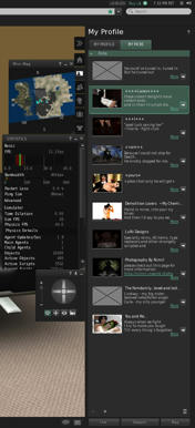
the picks section when i first looked at it, i about shit a brick.. everything was so damn tiny… i am one of those people who uses their picks to write mushy crap about my other half, and advertise my store and other junk like that.. so tiny ass picks was NOT COOL!
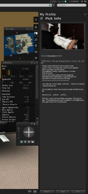
however if you hit the little grey arrow next to the more link you’ll get a full size pick with all the info on it. why can’t they do this with the regular profile info?
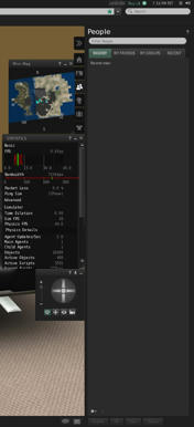
the next tab on the sidebar is “people” this includes a nearby list (which is a pathetic attempt at radar. not as good as emerald’s!) your friends list, your groups list, and an awesome tab called “recent” which allows you to see who you have spoken to recently. great for picking up convos after crashing.
this tab i don’t really mind. its a nice change from the old friends list style, and it makes it more accessable without losing your eye on the local chat window.
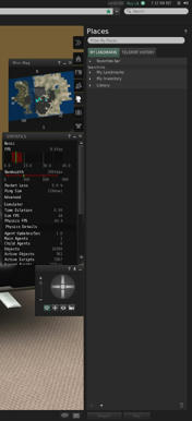
the next tab is “places”. pretty straight forward here.. you have a list of all your landmarks without all the inventory stuff. i like this tab.it also includes a teleport history so you can easily get back to where you were if you need to.
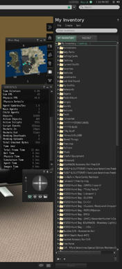
the next tab is inventory.. yay look at all that crap.. i don’t like the inventory being docked in the sidebar but eh.. at least if you hit new window (for sorting and stuff) you get another inventory window that isn’t docked inside that sidebar as well (that would drive me insane)
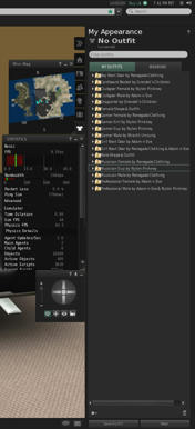
the final tab is a new one for second life. the appearance tab. this allows you to save an outfit to a folder for later use. right now all that i have in there are the example outfits that LL stuck in there. the apperance tab also has a wearing tab which is great because i am really spoiled on that with emerald.
so the side bar isn’t too horrible.. the main thing i would like is to be able to have those windows snap to the edge of the screen when the sidebar is closed. but that might just be me being picky.
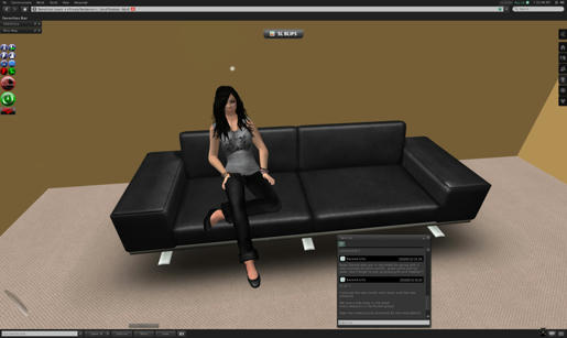
the “view” box (aka camera controls) can also be docked into the bottom bar and accessed from the view button, so i guess i’ll just have to get used to that and have a little bit less clutter on my screen. and i’ll minimize my minimap and stats boxes since we’re going to just sit here.
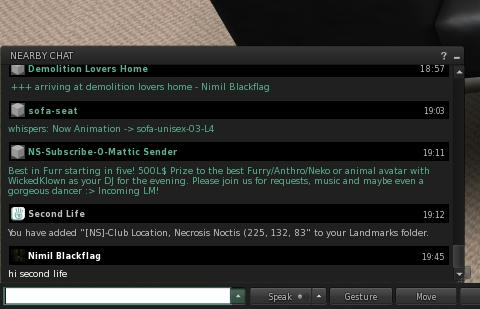
another thing i really like, the chat history box. i am one of those people who keeps this window open most of the time. i really like how they have styled the new history box, its a lot easier to tell who says what now, and you can definitely tell if its an object or a person speaking because of the icons next to them.
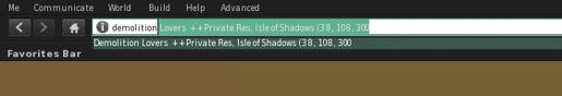
also on my like list, the address bar! i like that i can type in something and get a google like list of possible landmarks that i could be typing. it makes using those landmarks a bit easier.
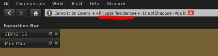
it also makes the title a bit more prominent (so people can see that my home is private and please gfto!)
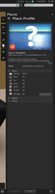
clicking on the little info button next to the land title pops the places sidebar up and gives you info about the place you’re at.
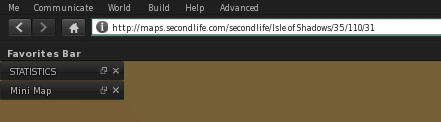
clicking on the bar its self gives you a spiffy slurl which is much nicer to deal with than the open map, copy slurl to clip board, paste somewhere, etc. it also allows you to paste an slurl in that box and teleport somewhere.
under that is the favourites bar which i haven’t used but apparently i can add my favourite lm’s to that not unlike my browser’s bookmarks bar.
something that everyone else was bitching about, the pie menu is gone and now we have a context menu and honestly? this doesn’t bother me! i guess i’m one of the few who can work with it and not have a problem. also, i like the sexy green selection frame instead of that bright ugly yellow yay!
of course i like the features i’m not showing here which is, tattoo layers and alpha layers. i will be making some things with that in the future.. if i can stand to use this client :p i also like the web on a prim thing even though people are screaming about its security hazards. i think it could become a useful tool for businesses.
under the hood i have noticed a major jump in fps as well as sculptie loading times. my fps in the house on emerald recently has been very low, but it seems to be a bit higher in the new 2.0 client. as well, sculpties and textures are rezzing much faster. not sure what emerald has done but fix it you guys!the client seems to be eating about the same amount of resources but i don’t see anything leaking horribly so that’s a good plus. lets how it keeps that up. amazingly, when i opened my windows task manager i noticed it was not eating 100% of my cpu as i usually see. its fluxing now between 79 and 89% cpu usage. this possibly could be the reason why i have better fps. my computer is not all that fancy so this is a big plus for me.
something that does bother me though, my ims show up on the right hand side of the screen. like i said before, stuff moved around makes my face melt off… i need my ims on the left with my chat window. i know i can tear them off and drag them over to the left, but i’d have to do that for every single window. if nothing else they should give us the ability to choose right or left for the window.
there are some things i could not find on this client. namely the option to turn off attached lights! please put this back in the menus somewhere LL! i hate facelights and i always have that off in other clients..
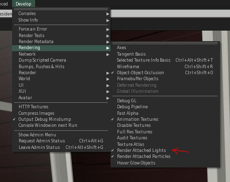
oh i just found it.. you have to enable another menu called “develop” and then look in rendering… the develop menu is enabled in the advanced menu. honestly.. why did we need another menu? just put it all in advanced, its not that badly cluttered >_<
i also find it strange that they moved the image upload menu to the advanced menu under shortcuts. why is this not somewhere more easily accessed? it could at least be placed in the build menu… putting it in the advanced menu under shortcuts makes it harder to find and being a creator you need to upload textures for your work!
another option i cannot find is enable hovertips on all objects. right now i can only see hover tips on clickable objects and people. i dislike this, as i like to hover over objects to quickly find out who owns them (when i need to know if something is mine or lucas or some other person’s which needs to be returned)
it took me forever to realize that the little “search” box up there was the only way to access search now. i am so used to it being a button at the bottom of my screen that i didn’t even think to look there.
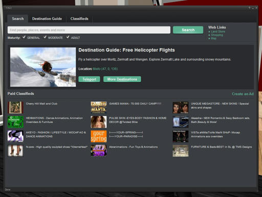
search seems mostly the same except for a few differences… to get those nice tabs where you have people and places and events you have to search for something first.
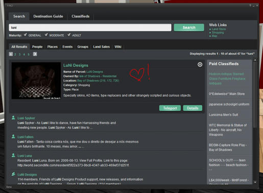
i do like how the search results fold out of the main search window, much nicer than having to hit back after reading though a search result’s info.
one thing about search that really sucks? you cannot access the people places events or group tabs without searching for something. this really makes it hard to browse for events without having a keyword in mind, something that lucas and i do frequently when we are bored.
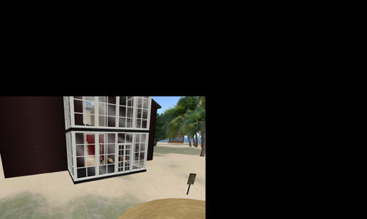
snapshots are fucked for me.. i have the tiny box in a big black square problem that some others are having. (its hard to see here because my blog is black, but if you click on the picture you’ll see what i mean). this pretty much kills the client for me, as i will not use anything that borks up photo taking. i also have no anti-aliasing… but that might be my fault because i’m not sure if i checked to make sure it was enabled before looking at the snapshot function.
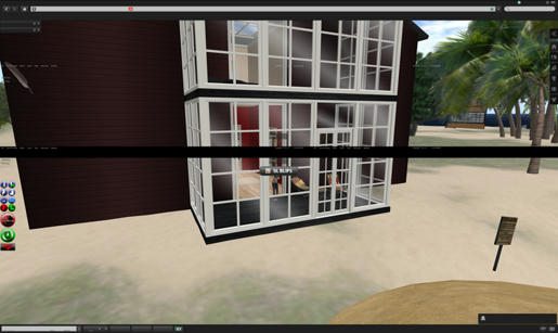
another weird snapshot issue, taking a photo with the interface and huds showing does not show the interface in the snapshot preview, and just look at what you get from taking a photo like that O_o. and that is why this entire blog was snapped with an external screenshot program!
so in closing.. not really digging the sl 2.0 client quite yet. i hope that they will take the time to look at all the things they have changed and make it much better before they push it on us as a final product. and if nothing else, i hope that the emerald devs will make a client with the old ui! i think that this thing has some potential but it also has the good old LL fail… it is still in beta though, so lets cross our fingers that they fix more and break less.
I freekin’ LOVE YOU, Nimil! This was so damn helpful (and funny).
*picks you up and smushes you in a huge hug*